|
Ascendo DataVault - BlackBerry Password Manager, Version 4, User Guide
Chapter 4.0 - Using DataVault on your Desktop
The Ascendo DataVault Desktop has many of the
same features as Ascendo DataVault for BlackBerry. In addition, Ascendo
DataVault Desktop provides advanced browser integration with Internet Explorer
and Firefox.
To start the DataVault
Desktop, click on the Start button in Microsoft Windows, then click on All
Programs. If you installed the DataVault Desktop correctly, you will see a
submenu for Ascendo DataVault. Move the cursor over the DataVault submenu and
several choices will appear.
- User Guide: Opens a PDF version of the
DataVault User Guide.
- Ascendo DataVault: Starts Ascendo DataVault
Desktop on your PC.
- Web Site: Goes to the DataVault product
page of Ascendo.com.
- Uninstall: Removes DataVault from your PC.
4.1 Choosing and Managing
your Password
When you start the DataVault Desktop for the
first time you will be asked to choose a password and then retype it. If you
plan to synchronize DataVault items between your BlackBerry and your Desktop, you
must select the same password for both. On subsequent start-ups you will be asked to
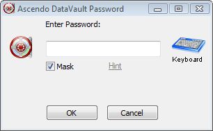
enter your password just once, see Figure 16.
Figure
16
The password in Figure 16 is masked, meaning
that an asterisk "*" appears in the place of each character that you
type. This is done to protect you from individuals who may be close by and
looking at your screen while you are typing your password. If you uncheck the Mask box,
the characters you enter
will appear as they normally would.
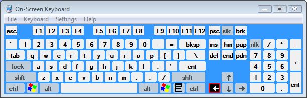
The Keyboard icon starts an on screen keyboard
that you can use to type your password using your mouse to select characters,
see Figure 17. Enter your master password with the screen keyboard safeguards
you from key logger software that may be installed on your computer.
Key loggers record each keystroke that you
enter on your physical keyboard. Hackers and identity thieves use key loggers to
obtain confidential information. Key loggers can be installed on your computer
in same way as viruses or spyware. When you use the screen keyboard, key loggers
record mouse clicks instead of characters which are useless to hackers.
Figure
17
The Reset option should not be used unless you forget your
password and are unable to retrieve it. If you click on Reset all the data in
DataVault will be deleted and you will be asked to select a new password.
You can set-up a Password Hint to retrieve your
password in case you forget it. A password hint is a question and response
that you choose. For example, you could enter "What was my first pet's name?"
as the question and "Lassie" as the response. If you click on Hint in
the password window, DataVault will display the hint question and ask you for
the hint response. If you answer the question
correctly, DataVault will display your password.
The first time you start DataVault, the Hint
option will be grayed out. You can only set up a hint once you have chosen a
master password and used it to start DataVault. To create a password hint, click
on Tools then Set Hint from the DataVault Desktop menu.
4.2 Desktop Start-Up Screen
To start Ascendo DataVault Desktop, click on
the Windows Start button, then click on the Ascendo DataVault submenu and select
Ascendo DataVault from the list of choices. Alternatively, you can click on the
Ascendo DataVault icon from the Windows desktop.
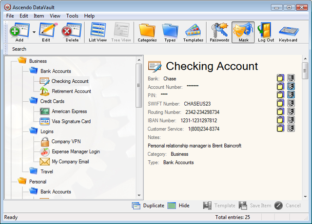
Once you have created your password, the
initial Start-Up Screen will be displayed, see Figure 18. The
cursor will appear next to the Search label at the top of the screen. You will
see a sample Email and Visa Item which you can edit or delete. The item
details for the highlighted row in the left hand panel will appear in the right
hand panel.
Figure
18
When you
enter characters into the Search field, the list of items will be reduced to display only the
items
that contain the string of characters you entered. See chapter on desktop List View for
more information on searching for Items.
You can resize the application window and
panels. If either of the panels is resized so that they cannot display all the
information contained in them, slider bars will appear along the right and
bottom sides.
The top row of buttons perform the following
functions.
- Add: Create a new item.
- Delete: Remove an item.
- List View: Switch to List View from Tree
View. In Figure 18 List View is already active so the List View button is
grayed out.
- Tree View: Switch to Tree View, see section
on Tree View.
- Passwords Generator: Open passwords
generator screen to randomly suggest passwords based on several user
settings.
- Templates: Add, Edit or Delete Templates
with default field labels for items.
- Categories: Add, Edit or Delete Categories
like Business, Personal, etc.
- Types: Add, Edit or Delete Types like,
Credit Cards, Logins, etc.
- Keyboard: Open screen keyboard to enter
characters with mouse instead of physical keyboard.
- Help (not pictured above): Open User Guide
in PDF format.
The drop down lists for Categories and Types,
below the search field, allow you to filter items. If you select Business from
the Categories drop-down list, only items with Category set to Business will
appear in the list. Set Categories and Types to All to show the entire list of
items. You can drag the Category and Types tool bar to position it above or to
the right of the Quick Search toolbar.
The bottom row of buttons perform the following
functions.
- Logout: Remove application window from view
and display password dialog window.
- Duplicate Item: Create a copy of the current
item.
- Hide/Show Details: Toggle between displaying
the right hand details panel and removing it from view to maximize the
available screen space available for field columns, see Figure 19.
- Edit: Modify current item.
- Save Template: Save icon, field labels,
category and type to reuse when creating similar items.
- Save Item: Save current edits to an item.
- Cancel: Cancel current edits to an item
without saving.
4.3 Viewing and Editing Items
In the panel on the right side of the screen
you will see the icon, category, type fields and notes for the highlighted item.
To display the details for a different item, click on another row in the left
hand column or use the arrow keys to scroll through the items.
To edit an item, click on the Edit button at
the bottom of the screen. You can also switch to Edit View by selecting File
> Edit from the screen menu or by using the shortcut CTRL-E. Once in Edit
mode, you can modify all of the item information in the right hand panel, see
Figure 19.
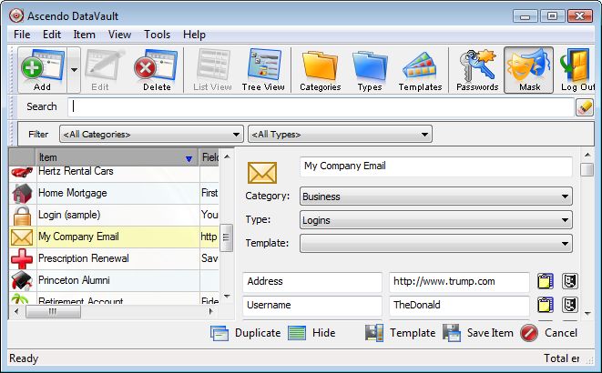
Figure 19
The Select Template field contains a drop-down
list of 20 predefined item formats such as Bank Account, Login or Visa. A
Template includes a default icon and up to ten field labels, see section on
using Templates for more information.
The example above displays an envelope icon
which appears to the left of the item in List View and as a large icon in View
Mode. You can change the icon by clicking on the arrow key to the right of the
icon. There are 100 icons to choose from.
The Item name, "Email (example)", is
highlighted as soon as you switch to Edit mode. Start typing to clear the sample
item name and enter a new item name. Field labels (left column) and field values
(right column) can be found directly below the item name. There are there are
ten fields for each item and a notes field that is off the screen in Figure 19.
You can use several editing features with the notes field such as carriage
return for new line, word wrap and cut & paste.
There are two buttons to the right of each
field. The first button copies the field value (right column) to the Window's
clipboard. From there, you can paste it into other Window's applications. For
example, you could copy a username or password into a browser form. The second
item is the mask button which will change the contents of the field value to
asterisks ("*"). Masking a field provides an extra level of security
in case somebody is able to see your screen while you are using DataVault.
You can select a Category or Type
from pull down list that appear beneath the item notes to filter the items that
appear in the left hand column.
You can also edit item names and fields in the
left hand column by clicking once to select a row and again to switch to edit
the field value.
When you are done editing, click on the Save
Item button below the item value column to save your modifications. Your updates
will appear in the left hand column. Click on the Cancel but to ignore your
updates. Clicking on Save Item or Cancel will return you to list view.
4.4 Adding and Deleting Items
To Add an Item, click on the Add button at the
top of the screen or select Edit from the screen menu option, then click on Add
Item in the submenu. The right hand panel will switch to a blank item form.
If some cases, you may have already saved a
record that is similar to the new one that you are about to create. You can
duplicate an item by scrolling to the item in the left hand column and clicking
on the Duplicate button. Alternatively you can select Duplicate from the screen
menu or use CTRL-D as a shortcut. Duplicating an item will create an exact copy
with the string of characters "(Copy)" next to the file name.
When adding an Item, the Category and Type
default to Unfiled. You can reset the Category and Type using the drop down
fields at the bottom of the details panel.
To Delete an Item, click on the Delete button
at the top of the screen or select the Edit menu option then click on Delete. As
an added security measure, DataVault creates a log of deleted items accessible
from the Tools option on the screen menu.
4.5 Using Templates
You can choose a Template by clicking on the
drop down arrow key to the right of the Templates field. A set of predefined
templates such as Visa, Email, etc. will appear. If you select a template, the
icon associated with an Item and the field labels will be changed. If you just
want to change the icon associated with an Item, click on the right arrow button
next to the icon.
If you click on the Save Template button then
the icon and field labels will be saved to the Template name of your choice and
can be reused with other Items.
4.6 Displaying Items in List
View
Once you have created several items you may
find yourself with a List View resembling Figure 20. If you are not already in
List View, click on the button labeled List View, third from the left along the
top row of buttons.
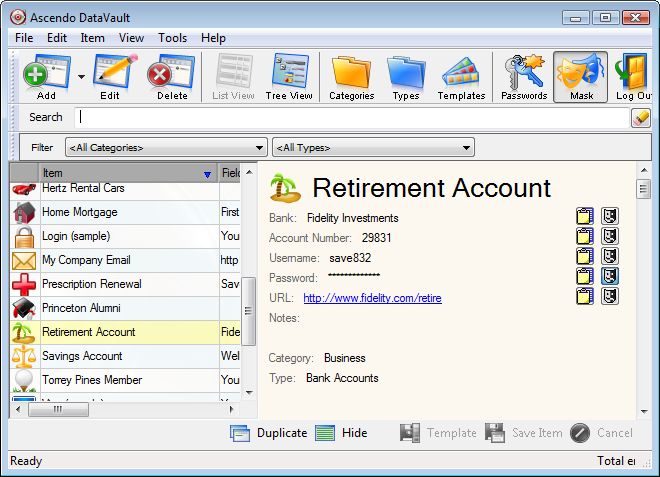
Figure 20
The List View screen provides the quickest way
to look-up and display options. When you enter the List View screen a blinking cursor will appear in the Quick
Search field. If you start typing characters, the list of items in the left hand
panel will be reduced to only those items containing the search string in the
item name. For example, entering "c" would display "Ascendo
DataVault" and "Blue Cross / Blue
Shield" but not "Blue Miles". To clear the
search field, click Escape or the pencil icon to the right of the search field.
To show the details of another item in the
right hand panel, click once on the item row in the left hand panel. If you wait
a second then click on the row a second time, the field under the cursor will
become editable. To edit the entire item, click on the Edit button along the
bottom of the screen.
Clicking on the Hide Details button at the
bottom left hand side of the screen, removes the detail panel from view, see
Figure 21. You can also Hide Details using the shortcut ALT-V H. Once clicked, the button label changes to Show Details and can be
pressed again to display the details panel.
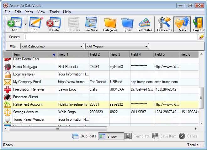
Figure 21
All field values can be modified directly in
the list. To modify a field, click once to select the row and a second time to
change the field to editable. If you want to show all fields and the notes
section you can resize the application window or resize the fields.
Category and Type filters are displayed
directly below the Quick search field. When you enter the List View screen, the
Category and Type will be set to All. To display only the Items in a specific
Category or Type, click on the down arrow next to the corresponding label and
choose from the elements in the drop down list.
Each column in the left had panel can be
ordered alphabetically. To order a column, click on the column header
("Item | Field 1 | Field 2,..."). Click again to change the order to
reverse alphabetical. A small blue arrow will appear in the header field to
indicate in which direction the field is ordered.
The left hand panel and the field widths can be
resized by clicking on the right edge and moving the cursor to the right, then
releasing the cursor. If the items list is
bigger than the panel, slider bars will appear along the right and bottom edges
allowing you to scroll vertically though the items or horizontally through the
fields.
4.7 Displaying Items in Tree
View
The Tree View provides an intuitive way to
display your information according to Categories and Types. When in Tree View,
items are displayed as the third level in a tree where the first level is
Categories and the second level is Types, see Figure 22. To display items in
Tree View, click on the button forth from the left along the top row of buttons.
You can drag & drop items from one type to
another, or types from one category or another. To drag & drop, position the
cursor over an element, click on the left mouse key, move the cursor to the
element you want to drop it in and release the left mouse key.
Figure 22
If a Category or Type has an open folder to the
left of it then you can Collapse that level of the tree to hide the information
below it. For example, if you collapse the "Business" category, Bank
Accounts, Logins and the items they contain will no longer appear. To collapse a level of the tree,
double click on an open Category or Type.
A closed folder indicates that
there are items beneath a branch that do not appear on the screen. If folder
next to the Business folder is closed and you double click on it, Banks
Accounts, Logins and associated items will reappear.
You can choose to use a minus sign
"-" instead of a closed folder or a plus sign "+" instead of
an open folder from the Tools > Options menu.
To expand all the branches in the tree, select
Expand All from the View menu or use CTRL-Shift-E as a shortcut. To collapse all
the branches in a tree, select Collapse All from the View menu or use
CTRL-SHIFT-C as a shortcut.
DataVault provides an Option to set a Default
Tree Display which determines what the tree looks like when you start the
application or switch to Tree View. The choices are Expanded, Collapsed or Last
which means that DataVault will remember which levels were expanded or collapsed
the last time you exited the application and return to that tree formation.
4.8 Browser Integration
When you install Ascendo DataVault Desktop a
plug-in will appear as a toolbar the next time you start your internet browser,
see Figure 23. The DataVault toolbar appears directly below the main toolbar and
contains icons for Web Items, Save Form and Generate Password.
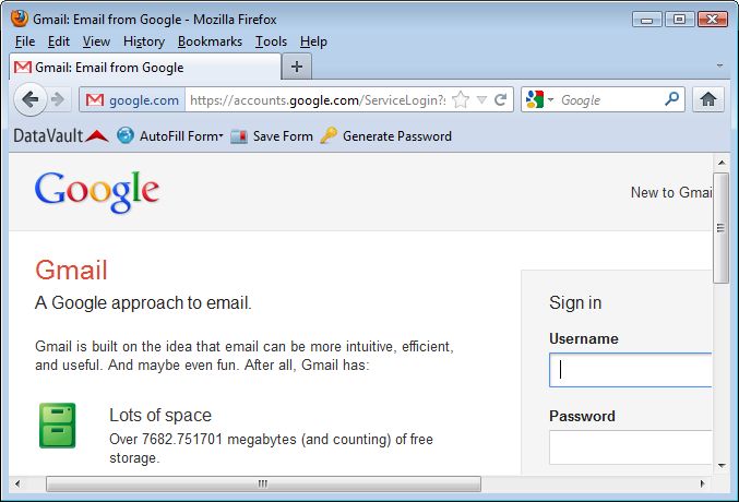
Figure 23
Field values stored in DataVault that contain
internet addresses beginning with "http://" will be stored as live
links to web sites. If you click on a live link, DataVault will start your
browser and open the page.
DataVault can automatically fill (auto-fill)
fields in a web form such as password and username. For example, you might
create an item called Gmail with fields for the login page, username and
password. If you click on the address (URL) for the login page, DataVault will
open your browser, go to the login page and auto-fill the username and
password.
To auto-fill a form you must enter label names
into DataVault that are the same as the field label names used internally by the
web site. These may be different than the web site screen labels and there is no
easy way to find them apart from viewing the source code for the page. To
simplify the process, DataVault provides a Save Form feature to create items
directly from web pages with the information necessary to auto-fill a
form.
To use the Save Form feature, go to a web form
and type in field values, see Figure 23. When you have typed in all the fields
you want to save, click on the Save Form button in the DataVault toolbar.
DataVault will create and display a new entry with the page title as the item
name and the field labels/values necessary to auto-fill the form. You can Edit,
Save or Cancel the item in DataVault. If an Item already exists with the same
URL, DataVault will ask you if you want to overwrite the item.
To access DataVault items for internet sites, click on the Web Items button in the toolbar.
A drop down list of sites will appear beneath the button. Click on a site to go
to the page.
The DataVault tool bar includes a button to Generate
Passwords. When you click on the button a dialog window will appear with a
randomly generated password and several options, see section on Password
Generator.
There several ways to configure the browser
integration features of DataVault. To display these choices, click on Tools in
the main menu and select Options from the submenu.
The Web Form Login setting under Browser
Integration determines whether on not DataVault will simulate pressing
Enter/Return after auto filling a form. If you select Automatic, DataVault will
manage the login process from beginning to end with only one click. However, web
sites use several methods to manage the Enter/Return key and DataVault may not
work with all sites. For this reason the Web Form Login button is initially set
to User Initiated.
The Form Field Entry setting controls whether
DataVault will automatically enter field values each time you go to a particular
web form. If you set this option to Automatic, the form will be filled whether
or not DataVault is running. If you set the option to User Initiated, you must
start DataVault and click on a live link to auto-fill a form.
Another way to use auto-fill without having to
start DataVault Desktop is to create a Windows desktop shortcut. You can create
a shortcut by right clicking on an item and selecting "Add shortcut on
Desktop" from the context menu.
4.9 Backup and Restore
The DataVault Desktop provides options to Backup
& Restore your data. When you backup you items with DataVault, your
information is password protected and encrypted using Advanced Encryption
Standard (AES) the official standard chosen by the US Government.
To Backup Items, click on File from the main menu select Backup. Select a file name and confirm
or click on the
Browse button to select a different directory.
To Restore Items, click on the File menu and
select Restore.
You can set an Option from the Tools menu to
create automatic backups. The files will be stored in a directory called
"\Automatic backups" off of the directory you chose to store the
DataVault.dat file with you items. The setting for Automatic Backup Count
controls the number of backup files that DataVault will create before deleting
the oldest files.
|